CLIENT: Prevail Jerky

Never settle. Always Prevail.

Naming | Copywriting | Logo design | Branding | Typography | Hand lettering | Package design | Icon design | Photography | Marketing collateral | Web Design

prevail-header-web.jpg


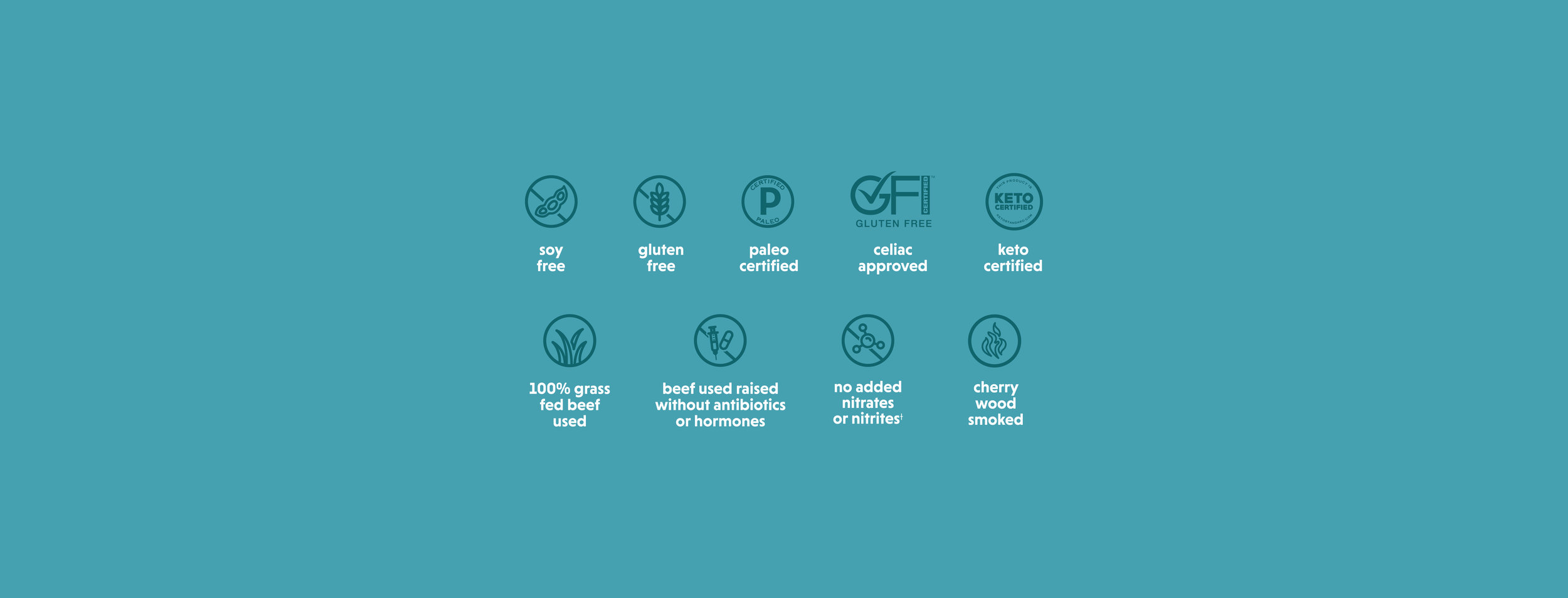
We were approached by a jerky brand that said they were the best in the game. After some taste testing, that did prove to be true. They didn’t invent healthy beef jerky; they reinvented it. And Rule #1? No sacrifices. They are committed to never adding soy, cane sugar, or any of that extra junk. So we wanted to help establish this new brand as the best product in the jerky aisle, period. Our design direction: unapologetically bold. Using a thick hand-drawn font and bold colors, we were able to create a package that demands the attention it deserves.


Prevail header.jpg
LogoSketches2.jpg
Logo Options .jpg
Prevail Logo_slogan.jpg
Prevail_Process.jpg
Lemongrass_Peppercorn_CloseUp.jpg
BusinessCards.jpg
Spicy_CloseUp copy.jpg
Lemongrass_FullLayout_NoJerky.jpg
Prevail_Process2.jpg
MockUp_Diagonal.jpg
original_web.jpg
Spicy_web.jpg
Lemongrass_web.jpg
Umami_web.jpg
WebsiteBugs.jpg
Umami_Back_MockUp.jpg
UpdatedTeriyaki_CloseUp_Above.jpg
Website_Ingredients.jpg